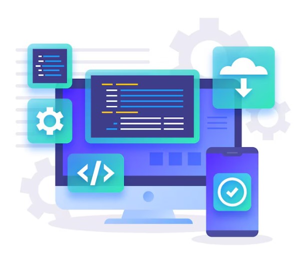
You have decided to engage in full-stack mobile app development. So, you should consider many factors in this process. Most importantly, you should consider the total user experience of the application. You should consider everything from user interface to graphic design. also, you should consider the app performance and seek support when something does not go as expected. Above all, you should consider every platform and what your users expect based on the platform you plan to work on to design your mobile apps.
User Experience
Among the many things to remember when designing and developing mobile apps, user experience is highly important. The better experience your users get from your app, the more frequently, they will visit your app. The user experience in full-stack mobile apps relies on several factors:
- Asynchronous considerations for UI
- Offline and network-interrupt experience
- Caching and other forms of persistence
- Consistency and familiarity with app brand across devices
- Device and platform-specific fonts and iconography
- Responsive and adaptive design
- Initial and subsequent loading animations
Indeed, some design aspects are uniform across mobile and web applications and sites. However, others are unique to each. In a broader sense, you can consider the body of the application and form controls. Do consider typography and font rendering. The other things to consider are navigation and component rendering. The reason is that these elements are to be addressed individually. Only then can you ensure the best user experience from your mobile apps?
Terms to Remember When Designing Mobile Apps
When you are planning to engage in designing full-stack mobile apps, you should learn some terms and their meaning. Here is the list of these terms:
- Offline First
- Mobile First
- Progressive Design
- Adaptive Design
- Responsive Design
You can get a brief understanding of these terms from the following paragraphs:
Offline First
Yes, you have guessed it right. It involves designing mobile apps that can function properly even when there is no internet access.
Mobile First
This is a term that web designers use when they intend to develop traditional web content in a way that the smaller screens of smartphones or other devices have the highest quality views and the first consideration views when possible.
Progressive Design
Progressive design is a term used to denote that your app loads quickly. Also, it means that your mobile apps have an authentication layer for tasks like form filling or setting the display of a map.
Adaptive Design
Many people confuse between adaptive design and responsive design. However, they are different. Adaptive design involves discrete and fixed measurements. For instance, in adaptive design, you will see more exact dimensions for different display resolutions.
Responsive Design
Responsive Design is a term used in web design when mobile devices came into the market. It uses the CSS Media query business size, logic and orientation features. Responsive design intends to respond to the changing and static features of the presentation of mobile applications.
So, you should remember and implement these features when you engage in the creation of mobile apps.