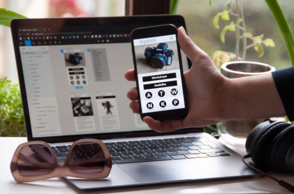
When talking about responsive design, most of us get one thing into our minds. It is desktop versus mobile devices. Does responsive design involve designing in a way that works across different sizes of screens? This is what many of us think responsive design is all about. But, it is more than that. In mobile app development, responsive design affects the context of a user. Also, it involves how an app can be the most responsive to the experience and needs of a user.
How is Your App Accessed?
Indeed, screen size is a factor in responsive mobile app development. However, it is just a tiny portion of the context. Other elements also decide the responsive design. These factors are based on how your mobile app is accessed like:
- The location of the user
- The noise and light level in the place where it is accessed
- The time at which a user accesses your mobile application
- How is the user holding his/her device and
- How they access their device the best like personal settings they have on their devices.
In short, the future of responsive mobile app development is the context of a user considering time and space. Also, it relies on the context of their devices in time and space. Further, it relies on the preferences of users on the particular device and time. Thankfully, when it comes to the development of websites, web browsers, these days give access to designers to leverage these inputs into their designs.
It is now possible for web designers to access the battery level of the device, orientation, and light preferences of different users or light levels. With these details, they can make their design choices based on these elements.
Location Detection in Mobile App Development
As mentioned earlier, location is one of the aspects that decide the responsiveness of your mobile app.
When you develop mobile apps on Swift and native Java, you can get to detect the location of users. You might have seen location access requested by many apps these days. For instance, fitness apps ask for location permission to track distance over time. In turn, these apps can evaluate pace.
To make your application responsive to users, make sure to use location access if required.
Time
You can relate time to a pillar of proximity. Similar to location, you should also consider time when it comes to providing the best experience to users with your application. Time is integrated into many of your decisions. For instance, it can be time until a particular event. Otherwise, it can be a discount available until a sale ends. You should integrate it to fit the needs of your users as closely as possible.
In short, the future is highly promising for responsive design. Many professionals engaged in mobile app development, take steps to make sure that their application stays as responsive as possible to users to give them the best experience. You can also join the wagon wheel today!